

[2014–2024]
COMMERCIAL PORTFOLIO
This is the part of the portfolio where I look backward. The projects collected below span roughly a decade of commercial product design across some of the studios that helped shape what digital experiences look and feel like today — ustwo, I&Co, Method, AKQA, Red Antler, Philosophie, Ueno — working with clients you've likely heard of: Google, McDonald's, Audible, P&G, Foursquare, WeWork, Northwestern Mutual, Thomson Reuters. The work here represents maybe fifteen percent of what I actually shipped during those years. The rest lives behind NDAs, in prototypes that didn't go anywhere, and in the texture of engagements that taught me as much but left nothing to point at. What follows is the visible part — and the part where I formalized my understanding of product design, UX, interface and interaction design, research, strategy, and the branding and marketing systems that hold all of it together.
[YEAR]
2017-2026
[CLIENT]
Various Studios
[TOOLS]
Figma, Framer,
Adobe Creative Suite
Blender, Rive
1.0
COMMERCIAL PORTFOLIO
This is the part of the portfolio where I look backward. The projects collected below span roughly a decade of commercial product design across some of the studios that helped shape what digital experiences look and feel like today — ustwo, I&Co, Method, AKQA, Red Antler, Philosophie, Ueno — working with clients you've likely heard of: Google, McDonald's, Audible, P&G, Foursquare, WeWork, Northwestern Mutual, Thomson Reuters. The work here represents maybe fifteen percent of what I actually shipped during those years. The rest lives behind NDAs, in prototypes that didn't go anywhere, and in the texture of engagements that taught me as much but left nothing to point at. What follows is the visible part — and the part where I formalized my understanding of product design, UX, interface and interaction design, research, strategy, and the branding and marketing systems that hold all of it together.
[YEAR]
2025-2026
[CLIENT]
Own Product
[TOOLS]
Figma, Claude Design
Codex, Pencil &
Claude Code
FIFTEEN PLUS YEARS. HERE I REFLECT ON A WEALTH OF DIFFERENT PRODUCTS BUILT IN SERVICE OF A WIDE ARRAY OF VAIRED INDUSTRIES AND CLIENTS. APPROXIMATELY TWENTY PERCENT OF THE WORK I'VE ACTUALLY SHIPPED DURING MY CAREER.
[FOREWARD]
There's a particular thing that happens when you spend most of a decade as a contractor and consultant on work like this: your name doesn't always make it onto the list when the product launches. I helped business owners ship things that changed the trajectory of their companies, often solving problems that were novel at the time, and have relatively little publicly to show for any of it beyond what I learned. Looking back, large sections of that period can feel less like a career I directed and more like a series of rooms I walked into — finances and timing dictating decisions as much as ambition did. I don't carry that as regret. The teams were extraordinary, the problems were real, and I came out of every project sharper than I went in. But this section exists, in part, to put my fingerprints back on the work — and to draw a clear line between the experience that taught me the craft and the work I'm doing now, on my own terms.
AVANTOS AI
[YEAR]
2015-2016
[STUDIO]
I&CO
[CLIENT]
[TOOLS]
Figma, Sketch

[FOREWARD]
In 2014, Google asked ustwo to help design the launch collection of watch faces for Wear OS — a brand new platform with no design vocabulary, no established patterns, and no clear sense of what people would actually want to look at on their wrist all day. I worked as one of five designers on the project, spending months sketching, prototyping, and testing on real hardware until we landed on a collection of twenty faces split between visually expressive designs and data-integrated ones built around real-time information like fitness metrics and weather. We shipped at Google I/O alongside the Watch Face API and contributed to the design guidelines that helped third-party developers build for the platform after us. The work was about restraint disguised as creativity. A face could look stunning in a mockup and fail completely on the wrist — battery, processor, and the unforgiving demand for true glanceability meant every decision had to earn its place against constraints we couldn't negotiate with. The lesson that stayed with me wasn't about wearables. It was about how much clarity a designer gains when the canvas stops being generous, and how often the strongest design choice is the one that subtracts.
AMAZON FIRE TV
[YEAR]
2015-2016
[STUDIO]
I&CO
[CLIENT]
[TOOLS]
Figma, Sketch
[FOREWARD]
In 2014, Google asked ustwo to help design the launch collection of watch faces for Wear OS — a brand new platform with no design vocabulary, no established patterns, and no clear sense of what people would actually want to look at on their wrist all day. I worked as one of five designers on the project, spending months sketching, prototyping, and testing on real hardware until we landed on a collection of twenty faces split between visually expressive designs and data-integrated ones built around real-time information like fitness metrics and weather. We shipped at Google I/O alongside the Watch Face API and contributed to the design guidelines that helped third-party developers build for the platform after us. The work was about restraint disguised as creativity. A face could look stunning in a mockup and fail completely on the wrist — battery, processor, and the unforgiving demand for true glanceability meant every decision had to earn its place against constraints we couldn't negotiate with. The lesson that stayed with me wasn't about wearables. It was about how much clarity a designer gains when the canvas stops being generous, and how often the strongest design choice is the one that subtracts.
AUDIBLE SLEEP
[YEAR]
2015-2016
[STUDIO]
I&CO
[CLIENT]
[TOOLS]
Figma, Sketch

[FOREWARD]
At the start of the COVID-19 pandemic, Audible saw an opening to extend beyond audiobooks and into the rapidly growing space of sleep and mental wellness. The company brought in I&Co to design and prototype a dedicated mobile app for sleep-related audio — a product that would help users build healthier nighttime habits while reinforcing Audible's position as a leader in spoken audio. I led UX on the project, working with a team of fifteen designers and strategists to develop the architecture, the personalization model, and the audio player that sat at the center of the experience. The product was built around two ideas: a Mood Forecast that let users self-report their nightly state, and a Bedtime/Rise Time window that fed a session generation engine producing tailored content for each night. The hardest part wasn't the features — it was the restraint. The product's success depended on how little the user had to engage with it, which meant every additional tap, screen, or animation was a potential point of friction at exactly the moment users wanted friction to disappear. We designed a player that asked users to interact with it twice during a successful session — start and stop — and then got out of the way. The project reinforced something I've carried into wellness work since: in this category, good UX is mostly knowing what to leave out.
ANDROID WEAR
[YEAR]
2015-2016
[STUDIO]
I&CO
[CLIENT]
[TOOLS]
Figma, Sketch

[FOREWARD]
In 2014, Google asked ustwo to help design the launch collection of watch faces for Wear OS — a brand new platform with no design vocabulary, no established patterns, and no clear sense of what people would actually want to look at on their wrist all day. I worked as one of five designers on the project, spending months sketching, prototyping, and testing on real hardware until we landed on a collection of twenty faces split between visually expressive designs and data-integrated ones built around real-time information like fitness metrics and weather. We shipped at Google I/O alongside the Watch Face API and contributed to the design guidelines that helped third-party developers build for the platform after us. The work was about restraint disguised as creativity. A face could look stunning in a mockup and fail completely on the wrist — battery, processor, and the unforgiving demand for true glanceability meant every decision had to earn its place against constraints we couldn't negotiate with. The lesson that stayed with me wasn't about wearables. It was about how much clarity a designer gains when the canvas stops being generous, and how often the strongest design choice is the one that subtracts.
PWC AUDITING
[YEAR]
2015-2016
[STUDIO]
I&CO
[CLIENT]
[TOOLS]
Figma, Sketch

[FOREWARD]
In 2014, Google asked ustwo to help design the launch collection of watch faces for Wear OS — a brand new platform with no design vocabulary, no established patterns, and no clear sense of what people would actually want to look at on their wrist all day. I worked as one of five designers on the project, spending months sketching, prototyping, and testing on real hardware until we landed on a collection of twenty faces split between visually expressive designs and data-integrated ones built around real-time information like fitness metrics and weather. We shipped at Google I/O alongside the Watch Face API and contributed to the design guidelines that helped third-party developers build for the platform after us. The work was about restraint disguised as creativity. A face could look stunning in a mockup and fail completely on the wrist — battery, processor, and the unforgiving demand for true glanceability meant every decision had to earn its place against constraints we couldn't negotiate with. The lesson that stayed with me wasn't about wearables. It was about how much clarity a designer gains when the canvas stops being generous, and how often the strongest design choice is the one that subtracts.
LIVE AUCTIONEERS
[YEAR]
2015-2016
[STUDIO]
I&CO
[CLIENT]
[TOOLS]
Figma, Sketch
[FOREWARD]
In 2014, Google asked ustwo to help design the launch collection of watch faces for Wear OS — a brand new platform with no design vocabulary, no established patterns, and no clear sense of what people would actually want to look at on their wrist all day. I worked as one of five designers on the project, spending months sketching, prototyping, and testing on real hardware until we landed on a collection of twenty faces split between visually expressive designs and data-integrated ones built around real-time information like fitness metrics and weather. We shipped at Google I/O alongside the Watch Face API and contributed to the design guidelines that helped third-party developers build for the platform after us. The work was about restraint disguised as creativity. A face could look stunning in a mockup and fail completely on the wrist — battery, processor, and the unforgiving demand for true glanceability meant every decision had to earn its place against constraints we couldn't negotiate with. The lesson that stayed with me wasn't about wearables. It was about how much clarity a designer gains when the canvas stops being generous, and how often the strongest design choice is the one that subtracts.
MCDONALDS KIOSK
[YEAR]
2015-2016
[STUDIO]
I&CO
[CLIENT]
[TOOLS]
Figma, Sketch

[FOREWARD]
McDonald's was in the middle of "Experience of the Future" — one of the most ambitious digital transformations in QSR history — and the self-order kiosks rolling out to thousands of locations globally weren't working as well as they needed to. Method had been partnering with McDonald's on a multi-year engagement across every customer touchpoint, and the kiosk was our piece. I led UX on the v2 redesign, starting with an audit of the existing application and field observation in real restaurants. Research spanned the US, UK, Australia, and China, combining remote and in-person studies to understand how ordering behavior shifted across cultures and demographics — what worked in one market often didn't translate to another, which forced the v2 architecture to be more flexible than it would have been otherwise. From there I worked on restructuring navigation, simplifying menu architecture, rethinking the customization flow, and integrating the kiosk into the global digital design system Method was building across mobile, web, and digital menu boards. The redesigned experience rolled out to 15,000+ locations worldwide and drove a 5–6% increase in average check size in the first year. The real lesson was about scale. You're not designing for a persona at McDonald's — you're designing for essentially everyone, from a kid ordering a Happy Meal to someone's grandmother who's never used a touchscreen. That range forces you to strip away every assumption about digital literacy and just make the thing obvious. It taught me that designing at true global scale isn't about clever interactions — it's about getting the fundamentals so right that they disappear.
OBAGI SKINCARE
[YEAR]
2015-2016
[STUDIO]
I&CO
[CLIENT]
[TOOLS]
Figma, Sketch

[FOREWARD]
In 2014, Google asked ustwo to help design the launch collection of watch faces for Wear OS — a brand new platform with no design vocabulary, no established patterns, and no clear sense of what people would actually want to look at on their wrist all day. I worked as one of five designers on the project, spending months sketching, prototyping, and testing on real hardware until we landed on a collection of twenty faces split between visually expressive designs and data-integrated ones built around real-time information like fitness metrics and weather. We shipped at Google I/O alongside the Watch Face API and contributed to the design guidelines that helped third-party developers build for the platform after us. The work was about restraint disguised as creativity. A face could look stunning in a mockup and fail completely on the wrist — battery, processor, and the unforgiving demand for true glanceability meant every decision had to earn its place against constraints we couldn't negotiate with. The lesson that stayed with me wasn't about wearables. It was about how much clarity a designer gains when the canvas stops being generous, and how often the strongest design choice is the one that subtracts.
TURNER TV PROTOTYPE
[YEAR]
2015-2016
[STUDIO]
I&CO
[CLIENT]
[TOOLS]
Figma, Sketch

[FOREWARD]
In 2014, Google asked ustwo to help design the launch collection of watch faces for Wear OS — a brand new platform with no design vocabulary, no established patterns, and no clear sense of what people would actually want to look at on their wrist all day. I worked as one of five designers on the project, spending months sketching, prototyping, and testing on real hardware until we landed on a collection of twenty faces split between visually expressive designs and data-integrated ones built around real-time information like fitness metrics and weather. We shipped at Google I/O alongside the Watch Face API and contributed to the design guidelines that helped third-party developers build for the platform after us. The work was about restraint disguised as creativity. A face could look stunning in a mockup and fail completely on the wrist — battery, processor, and the unforgiving demand for true glanceability meant every decision had to earn its place against constraints we couldn't negotiate with. The lesson that stayed with me wasn't about wearables. It was about how much clarity a designer gains when the canvas stops being generous, and how often the strongest design choice is the one that subtracts.
POSITIVE INTELLIGENCE BRAND
[YEAR]
2015-2016
[STUDIO]
I&CO
[CLIENT]
[TOOLS]
Figma, Sketch

[FOREWARD]
In 2014, Google asked ustwo to help design the launch collection of watch faces for Wear OS — a brand new platform with no design vocabulary, no established patterns, and no clear sense of what people would actually want to look at on their wrist all day. I worked as one of five designers on the project, spending months sketching, prototyping, and testing on real hardware until we landed on a collection of twenty faces split between visually expressive designs and data-integrated ones built around real-time information like fitness metrics and weather. We shipped at Google I/O alongside the Watch Face API and contributed to the design guidelines that helped third-party developers build for the platform after us. The work was about restraint disguised as creativity. A face could look stunning in a mockup and fail completely on the wrist — battery, processor, and the unforgiving demand for true glanceability meant every decision had to earn its place against constraints we couldn't negotiate with. The lesson that stayed with me wasn't about wearables. It was about how much clarity a designer gains when the canvas stops being generous, and how often the strongest design choice is the one that subtracts.
NORTHWESTERN MUTUAL
[YEAR]
2015-2016
[STUDIO]
I&CO
[CLIENT]
[TOOLS]
Figma, Sketch

[FOREWARD]
In 2014, Google asked ustwo to help design the launch collection of watch faces for Wear OS — a brand new platform with no design vocabulary, no established patterns, and no clear sense of what people would actually want to look at on their wrist all day. I worked as one of five designers on the project, spending months sketching, prototyping, and testing on real hardware until we landed on a collection of twenty faces split between visually expressive designs and data-integrated ones built around real-time information like fitness metrics and weather. We shipped at Google I/O alongside the Watch Face API and contributed to the design guidelines that helped third-party developers build for the platform after us. The work was about restraint disguised as creativity. A face could look stunning in a mockup and fail completely on the wrist — battery, processor, and the unforgiving demand for true glanceability meant every decision had to earn its place against constraints we couldn't negotiate with. The lesson that stayed with me wasn't about wearables. It was about how much clarity a designer gains when the canvas stops being generous, and how often the strongest design choice is the one that subtracts.
FI DOG COLLAR
[YEAR]
2015-2016
[STUDIO]
I&CO
[CLIENT]
[TOOLS]
Figma, Sketch

[FOREWARD]
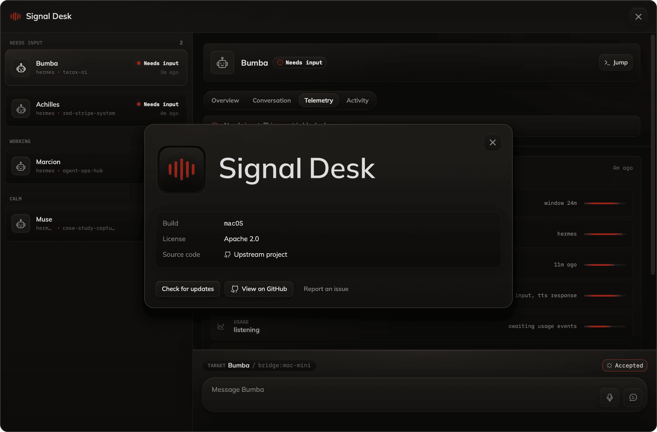
I'm a designer who builds. Over the last year I built an autonomous multi-agent system that runs my work around the clock — it writes code, triages my inbox, and ships pull requests while I sleep — and then designed the surface I actually use to operate it. Both halves of that sentence turned out to be hard, and the second one surprised me. Building the engine was the kind of hard I expected: architecture, constraints, a year of decisions about how a system should behave when no one is watching. But the moment it worked, a second problem appeared that I hadn't planned for. A mind that never stops is only as useful as your ability to watch it, steer it, and trust it enough to walk away. That's not an engineering problem. It's an interface problem — which means it was mine. So I designed the operator's surface three times before I got it right. Twice I reached for the familiar shapes a designer reaches for, and built them well, and abandoned them anyway. The third one is the one I keep open all day. This is the story of both: the engine, and the three attempts it took to find the right way to hold it.
REUTERS TV
[YEAR]
2015-2016
[STUDIO]
I&CO
[CLIENT]
[TOOLS]
Figma, Sketch

[FOREWARD]
Thomson Reuters came to Ueno with a deceptively simple question: most news apps dump a feed on you and let you drown — what if you could just tell the app how much time you had, and have it build you a newscast to fit? Reuters TV let users specify a window between 5 and 30 minutes, then dynamically assembled a personalized broadcast from segments produced by hundreds of Reuters journalists worldwide. I worked with Ueno's design team on UI/UX across web and mobile platforms, spanning the signature time-selection interaction, the playlist and player experience, the cross-platform design system, and the lean-back adaptations required for living-room devices like Apple TV and Roku. The product demanded that two things feel effortless at once: telling the app how much time you had, and trusting that what it built was worth watching. That meant a time selector that felt like saying "I have 10 minutes, go" rather than configuring a settings panel, a playlist surface that stayed out of the way during playback, and an entirely different interaction model on TV — remote-driven, sparser hierarchy, built for viewing from across the room. We launched across iOS, Android, Apple TV, Roku, and web in February 2015, and the app ran for nearly five years before Reuters consolidated its video content back into the main news app. The product didn't survive corporate consolidation, but the design problem at its center remains a genuinely interesting one — how do you make a generated experience feel curated, not algorithmic? That tension between automation and editorial craft was the whole project, and it's a question that's only become more important as more of our media diets become machine-assembled.
GERO TIME MANAGEMENT
[YEAR]
2015-2016
[STUDIO]
I&CO
[CLIENT]
[TOOLS]
Figma, Sketch

[FOREWARD]
In 2014, Google asked ustwo to help design the launch collection of watch faces for Wear OS — a brand new platform with no design vocabulary, no established patterns, and no clear sense of what people would actually want to look at on their wrist all day. I worked as one of five designers on the project, spending months sketching, prototyping, and testing on real hardware until we landed on a collection of twenty faces split between visually expressive designs and data-integrated ones built around real-time information like fitness metrics and weather. We shipped at Google I/O alongside the Watch Face API and contributed to the design guidelines that helped third-party developers build for the platform after us. The work was about restraint disguised as creativity. A face could look stunning in a mockup and fail completely on the wrist — battery, processor, and the unforgiving demand for true glanceability meant every decision had to earn its place against constraints we couldn't negotiate with. The lesson that stayed with me wasn't about wearables. It was about how much clarity a designer gains when the canvas stops being generous, and how often the strongest design choice is the one that subtracts.
FOURSQUARE REBRAND
[YEAR]
2015-2016
[STUDIO]
I&CO
[CLIENT]
[TOOLS]
Figma, Sketch

[FOREWARD]
Foursquare was splitting in two. The check-in — the product that had defined location-based social networking for years — was migrating to a new app called Swarm, and Foursquare itself was pivoting to become a personalized local discovery platform. Co-founder Dennis Crowley brought in Red Antler to collaborate on the rebrand and navigate the product transition, with unusually high stakes: Foursquare had to shed years of brand equity tied to the check-in and re-emerge as something fundamentally different, without losing recognition along the way. I worked with the Red Antler team to generate brand assets and materials across the new identity — production-intensive work taking the strategic direction and the new visual language and building it out across the full system of touchpoints. The new identity centered on a superhero-style "F" monogram that doubled as a map pin, a mark that had to read as a flag, a badge, and a speech bubble depending on context — and work at 16x16 pixels next to the Facebooks and Twitters of the world. The brand palette shifted to a bold blue-pink-white combination meant to signal creativity and energy. Early concepts explored evolutions of the existing brand, but the scale of the product change demanded something that felt new rather than updated, and the app was always the primary canvas — every brand decision tested against how it would feel on a phone screen. The new identity launched in July 2014 and became one of the more talked-about rebrands of that year. The lesson stayed with me: when you're building assets that millions of people will see on their home screen, you can't hide behind complexity. Every detail either earns its place or it goes.
WEWORK OPEN STUDIO
[YEAR]
2015-2016
[STUDIO]
I&CO
[CLIENT]
[TOOLS]
Figma, Sketch

[FOREWARD]
WeWork's rapid expansion was outpacing its ability to fill the spaces it kept acquiring, and the sales team needed a better way to communicate the value of being a tenant. The company brought in Philosophie to prototype an internal sales tool built for in-room pitches on tablets and large touchscreens, and I served as Design Director — leading UX and UI direction across a small team of designers, a PM, and an engineering resource, and working directly with WeWork's internal design and product teams to keep the brand experience tight. The work started with research into how reps actually pitched: stakeholder interviews surfaced wildly different selling styles, a pitch process that ran long enough that even experienced reps lost key points, and a patchwork of disconnected tools that meant no two presentations looked alike. From there we designed a flexible navigation model, a streamlined search experience anchored in geolocation and building type, and a virtual touring interface built around 2D floorplans, 3D renders, and immersive walkthroughs — letting the high-fidelity assets carry the visual weight while the UI provided clean, minimal controls. We delivered a high-fidelity prototype end-to-end in under four months, validated through a diary study with real reps using it in real pitches. The lesson I took from the project was about internal tools specifically: the best ones bend around their users rather than asking users to bend around them. Sales reps had hard-earned, idiosyncratic pitch styles, and the design's job was to amplify those styles — not standardize them.
P&G BEAUTY SPHERE
[YEAR]
2015-2016
[STUDIO]
I&CO
[CLIENT]
[TOOLS]
Figma, Sketch

[FOREWARD]
P&G came to AKQA wanting to redefine its beauty brand experience for a new generation of consumers — people whose buying decisions were increasingly shaped by sustainability, transparency, and a company's willingness to show its work. The result was The Beauty Sphere, an immersive 3D environment that turned P&G's sustainability story into something users could actually move through. I led UX on The Royal Garden Kew, the hero experience at the center of the world — a gamified tropical greenhouse where users followed a maze, collected plant samples used in P&G's products, and received a shareable artifact at the end paired with a real-world pledge to plant a tree in their name. My work spanned research, flow diagramming, wireframing, and spatial navigation, alongside close coordination with 3D artists, visual designers, and sound designers to translate the concept into a coherent build across web and mobile. The hardest design problem turned out to be the one I didn't expect: how do you let users choose a direction at a crossroad in 3D space without breaking immersion? We explored a dozen models before landing on the right one. The project reinforced that immersive design isn't about adding more — it's about making sure every element earns its place in service of a story the user actually wants to follow. Sustainability is an easy message to flatten into a brand campaign. Making it tangible was the real assignment.
5. OUTRO
[CHAPTER END]
What I take from this stretch of work is less a collection of case studies than a foundation. Ten years inside the rooms where talented teams shipped real products at real scale taught me something you can't shortcut — how design actually gets made when the stakes are real and the timeline isn't generous. Product design, UX, interaction, interface, research, strategy, brand, marketing — I learned each of these not from a book but from the practice of doing them alongside people who were exceptional at one or more of them. That's the inheritance. It's also the reason I'm building differently now. A decade of commercial work for other people's businesses is an extraordinary education and an easy blind spot — it's possible to spend years in service of someone else's vision and forget you're allowed to have one of your own. The pivot to AI, the autonomous system, the cockpit — none of it is a clean break from the work in this section. It's the inheritance of it, finally pointed at something I own.
THE PROJECTS IN THIS SECTION TAUGHT ME HOW TO BUILD. WHAT COMES NEXT IS WHAT I DO WITH THAT — ON MY OWN TERMS, FOR MY OWN REASONS, AGAINST MY OWN VISION.
The studios and brands above taught me how to build. The work that follows — the engine, the cockpit, what comes after — is what happens when that craft gets turned inward. I'm grateful for the years and the teams, and equally grateful to be done treating the next decade as something to be negotiated. The experience is mine. So is what I do with it.

NEXT PROJECT
BUMBA MODULAR FRAMEWORK
A RESEARCH PROJECT
FIFTEEN PLUS YEARS. HERE I REFLECT ON A WEALTH OF DIFFERENT PRODUCTS BUILT IN SERVICE OF A WIDE ARRAY OF VAIRED INDUSTRIES AND CLIENTS. APPROXIMATELY TWENTY PERCENT OF THE WORK I'VE ACTUALLY SHIPPED DURING MY CAREER.
[FOREWARD]
There's a particular thing that happens when you spend most of a decade as a contractor and consultant on work like this: your name doesn't always make it onto the list when the product launches. I helped business owners ship things that changed the trajectory of their companies, often solving problems that were novel at the time, and have relatively little publicly to show for any of it beyond what I learned. Looking back, large sections of that period can feel less like a career I directed and more like a series of rooms I walked into — finances and timing dictating decisions as much as ambition did. I don't carry that as regret. The teams were extraordinary, the problems were real, and I came out of every project sharper than I went in. But this section exists, in part, to put my fingerprints back on the work — and to draw a clear line between the experience that taught me the craft and the work I'm doing now, on my own terms.
AVANTOS AI
[YEAR]
2015-2016
[STUDIO]
I&CO
[CLIENT]
[TOOLS]
Figma, Sketch
[FOREWARD]
In 2014, Google asked ustwo to help design the launch collection of watch faces for Wear OS — a brand new platform with no design vocabulary, no established patterns, and no clear sense of what people would actually want to look at on their wrist all day. I worked as one of five designers on the project, spending months sketching, prototyping, and testing on real hardware until we landed on a collection of twenty faces split between visually expressive designs and data-integrated ones built around real-time information like fitness metrics and weather. We shipped at Google I/O alongside the Watch Face API and contributed to the design guidelines that helped third-party developers build for the platform after us. The work was about restraint disguised as creativity. A face could look stunning in a mockup and fail completely on the wrist — battery, processor, and the unforgiving demand for true glanceability meant every decision had to earn its place against constraints we couldn't negotiate with. The lesson that stayed with me wasn't about wearables. It was about how much clarity a designer gains when the canvas stops being generous, and how often the strongest design choice is the one that subtracts.
AMAZON FIRE TV
[YEAR]
2015-2016
[STUDIO]
I&CO
[CLIENT]
[TOOLS]
Figma, Sketch
[FOREWARD]
In 2014, Google asked ustwo to help design the launch collection of watch faces for Wear OS — a brand new platform with no design vocabulary, no established patterns, and no clear sense of what people would actually want to look at on their wrist all day. I worked as one of five designers on the project, spending months sketching, prototyping, and testing on real hardware until we landed on a collection of twenty faces split between visually expressive designs and data-integrated ones built around real-time information like fitness metrics and weather. We shipped at Google I/O alongside the Watch Face API and contributed to the design guidelines that helped third-party developers build for the platform after us. The work was about restraint disguised as creativity. A face could look stunning in a mockup and fail completely on the wrist — battery, processor, and the unforgiving demand for true glanceability meant every decision had to earn its place against constraints we couldn't negotiate with. The lesson that stayed with me wasn't about wearables. It was about how much clarity a designer gains when the canvas stops being generous, and how often the strongest design choice is the one that subtracts.
AUDIBLE SLEEP
[YEAR]
2015-2016
[STUDIO]
I&CO
[CLIENT]
[TOOLS]
Figma, Sketch
[FOREWARD]
At the start of the COVID-19 pandemic, Audible saw an opening to extend beyond audiobooks and into the rapidly growing space of sleep and mental wellness. The company brought in I&Co to design and prototype a dedicated mobile app for sleep-related audio — a product that would help users build healthier nighttime habits while reinforcing Audible's position as a leader in spoken audio. I led UX on the project, working with a team of fifteen designers and strategists to develop the architecture, the personalization model, and the audio player that sat at the center of the experience. The product was built around two ideas: a Mood Forecast that let users self-report their nightly state, and a Bedtime/Rise Time window that fed a session generation engine producing tailored content for each night. The hardest part wasn't the features — it was the restraint. The product's success depended on how little the user had to engage with it, which meant every additional tap, screen, or animation was a potential point of friction at exactly the moment users wanted friction to disappear. We designed a player that asked users to interact with it twice during a successful session — start and stop — and then got out of the way. The project reinforced something I've carried into wellness work since: in this category, good UX is mostly knowing what to leave out.
ANDROID WEAR
[YEAR]
2015-2016
[STUDIO]
I&CO
[CLIENT]
[TOOLS]
Figma, Sketch
[FOREWARD]
In 2014, Google asked ustwo to help design the launch collection of watch faces for Wear OS — a brand new platform with no design vocabulary, no established patterns, and no clear sense of what people would actually want to look at on their wrist all day. I worked as one of five designers on the project, spending months sketching, prototyping, and testing on real hardware until we landed on a collection of twenty faces split between visually expressive designs and data-integrated ones built around real-time information like fitness metrics and weather. We shipped at Google I/O alongside the Watch Face API and contributed to the design guidelines that helped third-party developers build for the platform after us. The work was about restraint disguised as creativity. A face could look stunning in a mockup and fail completely on the wrist — battery, processor, and the unforgiving demand for true glanceability meant every decision had to earn its place against constraints we couldn't negotiate with. The lesson that stayed with me wasn't about wearables. It was about how much clarity a designer gains when the canvas stops being generous, and how often the strongest design choice is the one that subtracts.
PWC AUDITING
[YEAR]
2015-2016
[STUDIO]
I&CO
[CLIENT]
[TOOLS]
Figma, Sketch
[FOREWARD]
In 2014, Google asked ustwo to help design the launch collection of watch faces for Wear OS — a brand new platform with no design vocabulary, no established patterns, and no clear sense of what people would actually want to look at on their wrist all day. I worked as one of five designers on the project, spending months sketching, prototyping, and testing on real hardware until we landed on a collection of twenty faces split between visually expressive designs and data-integrated ones built around real-time information like fitness metrics and weather. We shipped at Google I/O alongside the Watch Face API and contributed to the design guidelines that helped third-party developers build for the platform after us. The work was about restraint disguised as creativity. A face could look stunning in a mockup and fail completely on the wrist — battery, processor, and the unforgiving demand for true glanceability meant every decision had to earn its place against constraints we couldn't negotiate with. The lesson that stayed with me wasn't about wearables. It was about how much clarity a designer gains when the canvas stops being generous, and how often the strongest design choice is the one that subtracts.
LIVE AUCTIONEERS
[YEAR]
2015-2016
[STUDIO]
I&CO
[CLIENT]
[TOOLS]
Figma, Sketch
[FOREWARD]
In 2014, Google asked ustwo to help design the launch collection of watch faces for Wear OS — a brand new platform with no design vocabulary, no established patterns, and no clear sense of what people would actually want to look at on their wrist all day. I worked as one of five designers on the project, spending months sketching, prototyping, and testing on real hardware until we landed on a collection of twenty faces split between visually expressive designs and data-integrated ones built around real-time information like fitness metrics and weather. We shipped at Google I/O alongside the Watch Face API and contributed to the design guidelines that helped third-party developers build for the platform after us. The work was about restraint disguised as creativity. A face could look stunning in a mockup and fail completely on the wrist — battery, processor, and the unforgiving demand for true glanceability meant every decision had to earn its place against constraints we couldn't negotiate with. The lesson that stayed with me wasn't about wearables. It was about how much clarity a designer gains when the canvas stops being generous, and how often the strongest design choice is the one that subtracts.
MCDONALDS KIOSK
[YEAR]
2015-2016
[STUDIO]
I&CO
[CLIENT]
[TOOLS]
Figma, Sketch
[FOREWARD]
McDonald's was in the middle of "Experience of the Future" — one of the most ambitious digital transformations in QSR history — and the self-order kiosks rolling out to thousands of locations globally weren't working as well as they needed to. Method had been partnering with McDonald's on a multi-year engagement across every customer touchpoint, and the kiosk was our piece. I led UX on the v2 redesign, starting with an audit of the existing application and field observation in real restaurants. Research spanned the US, UK, Australia, and China, combining remote and in-person studies to understand how ordering behavior shifted across cultures and demographics — what worked in one market often didn't translate to another, which forced the v2 architecture to be more flexible than it would have been otherwise. From there I worked on restructuring navigation, simplifying menu architecture, rethinking the customization flow, and integrating the kiosk into the global digital design system Method was building across mobile, web, and digital menu boards. The redesigned experience rolled out to 15,000+ locations worldwide and drove a 5–6% increase in average check size in the first year. The real lesson was about scale. You're not designing for a persona at McDonald's — you're designing for essentially everyone, from a kid ordering a Happy Meal to someone's grandmother who's never used a touchscreen. That range forces you to strip away every assumption about digital literacy and just make the thing obvious. It taught me that designing at true global scale isn't about clever interactions — it's about getting the fundamentals so right that they disappear.
OBAGI SKINCARE
[YEAR]
2015-2016
[STUDIO]
I&CO
[CLIENT]
[TOOLS]
Figma, Sketch
[FOREWARD]
In 2014, Google asked ustwo to help design the launch collection of watch faces for Wear OS — a brand new platform with no design vocabulary, no established patterns, and no clear sense of what people would actually want to look at on their wrist all day. I worked as one of five designers on the project, spending months sketching, prototyping, and testing on real hardware until we landed on a collection of twenty faces split between visually expressive designs and data-integrated ones built around real-time information like fitness metrics and weather. We shipped at Google I/O alongside the Watch Face API and contributed to the design guidelines that helped third-party developers build for the platform after us. The work was about restraint disguised as creativity. A face could look stunning in a mockup and fail completely on the wrist — battery, processor, and the unforgiving demand for true glanceability meant every decision had to earn its place against constraints we couldn't negotiate with. The lesson that stayed with me wasn't about wearables. It was about how much clarity a designer gains when the canvas stops being generous, and how often the strongest design choice is the one that subtracts.
TURNER TV PROTOTYPE
[YEAR]
2015-2016
[STUDIO]
I&CO
[CLIENT]
[TOOLS]
Figma, Sketch
[FOREWARD]
In 2014, Google asked ustwo to help design the launch collection of watch faces for Wear OS — a brand new platform with no design vocabulary, no established patterns, and no clear sense of what people would actually want to look at on their wrist all day. I worked as one of five designers on the project, spending months sketching, prototyping, and testing on real hardware until we landed on a collection of twenty faces split between visually expressive designs and data-integrated ones built around real-time information like fitness metrics and weather. We shipped at Google I/O alongside the Watch Face API and contributed to the design guidelines that helped third-party developers build for the platform after us. The work was about restraint disguised as creativity. A face could look stunning in a mockup and fail completely on the wrist — battery, processor, and the unforgiving demand for true glanceability meant every decision had to earn its place against constraints we couldn't negotiate with. The lesson that stayed with me wasn't about wearables. It was about how much clarity a designer gains when the canvas stops being generous, and how often the strongest design choice is the one that subtracts.
POSITIVE INTELLIGENCE BRAND
[YEAR]
2015-2016
[STUDIO]
I&CO
[CLIENT]
[TOOLS]
Figma, Sketch
[FOREWARD]
In 2014, Google asked ustwo to help design the launch collection of watch faces for Wear OS — a brand new platform with no design vocabulary, no established patterns, and no clear sense of what people would actually want to look at on their wrist all day. I worked as one of five designers on the project, spending months sketching, prototyping, and testing on real hardware until we landed on a collection of twenty faces split between visually expressive designs and data-integrated ones built around real-time information like fitness metrics and weather. We shipped at Google I/O alongside the Watch Face API and contributed to the design guidelines that helped third-party developers build for the platform after us. The work was about restraint disguised as creativity. A face could look stunning in a mockup and fail completely on the wrist — battery, processor, and the unforgiving demand for true glanceability meant every decision had to earn its place against constraints we couldn't negotiate with. The lesson that stayed with me wasn't about wearables. It was about how much clarity a designer gains when the canvas stops being generous, and how often the strongest design choice is the one that subtracts.
NORTHWESTERN MUTUAL
[YEAR]
2015-2016
[STUDIO]
I&CO
[CLIENT]
[TOOLS]
Figma, Sketch
[FOREWARD]
In 2014, Google asked ustwo to help design the launch collection of watch faces for Wear OS — a brand new platform with no design vocabulary, no established patterns, and no clear sense of what people would actually want to look at on their wrist all day. I worked as one of five designers on the project, spending months sketching, prototyping, and testing on real hardware until we landed on a collection of twenty faces split between visually expressive designs and data-integrated ones built around real-time information like fitness metrics and weather. We shipped at Google I/O alongside the Watch Face API and contributed to the design guidelines that helped third-party developers build for the platform after us. The work was about restraint disguised as creativity. A face could look stunning in a mockup and fail completely on the wrist — battery, processor, and the unforgiving demand for true glanceability meant every decision had to earn its place against constraints we couldn't negotiate with. The lesson that stayed with me wasn't about wearables. It was about how much clarity a designer gains when the canvas stops being generous, and how often the strongest design choice is the one that subtracts.
FI DOG COLLAR
[YEAR]
2015-2016
[STUDIO]
I&CO
[CLIENT]
[TOOLS]
Figma, Sketch
[FOREWARD]
I'm a designer who builds. Over the last year I built an autonomous multi-agent system that runs my work around the clock — it writes code, triages my inbox, and ships pull requests while I sleep — and then designed the surface I actually use to operate it. Both halves of that sentence turned out to be hard, and the second one surprised me. Building the engine was the kind of hard I expected: architecture, constraints, a year of decisions about how a system should behave when no one is watching. But the moment it worked, a second problem appeared that I hadn't planned for. A mind that never stops is only as useful as your ability to watch it, steer it, and trust it enough to walk away. That's not an engineering problem. It's an interface problem — which means it was mine. So I designed the operator's surface three times before I got it right. Twice I reached for the familiar shapes a designer reaches for, and built them well, and abandoned them anyway. The third one is the one I keep open all day. This is the story of both: the engine, and the three attempts it took to find the right way to hold it.
REUTERS TV
[YEAR]
2015-2016
[STUDIO]
I&CO
[CLIENT]
[TOOLS]
Figma, Sketch
[FOREWARD]
Thomson Reuters came to Ueno with a deceptively simple question: most news apps dump a feed on you and let you drown — what if you could just tell the app how much time you had, and have it build you a newscast to fit? Reuters TV let users specify a window between 5 and 30 minutes, then dynamically assembled a personalized broadcast from segments produced by hundreds of Reuters journalists worldwide. I worked with Ueno's design team on UI/UX across web and mobile platforms, spanning the signature time-selection interaction, the playlist and player experience, the cross-platform design system, and the lean-back adaptations required for living-room devices like Apple TV and Roku. The product demanded that two things feel effortless at once: telling the app how much time you had, and trusting that what it built was worth watching. That meant a time selector that felt like saying "I have 10 minutes, go" rather than configuring a settings panel, a playlist surface that stayed out of the way during playback, and an entirely different interaction model on TV — remote-driven, sparser hierarchy, built for viewing from across the room. We launched across iOS, Android, Apple TV, Roku, and web in February 2015, and the app ran for nearly five years before Reuters consolidated its video content back into the main news app. The product didn't survive corporate consolidation, but the design problem at its center remains a genuinely interesting one — how do you make a generated experience feel curated, not algorithmic? That tension between automation and editorial craft was the whole project, and it's a question that's only become more important as more of our media diets become machine-assembled.
GERO TIME MANAGEMENT
[YEAR]
2015-2016
[STUDIO]
I&CO
[CLIENT]
[TOOLS]
Figma, Sketch
[FOREWARD]
In 2014, Google asked ustwo to help design the launch collection of watch faces for Wear OS — a brand new platform with no design vocabulary, no established patterns, and no clear sense of what people would actually want to look at on their wrist all day. I worked as one of five designers on the project, spending months sketching, prototyping, and testing on real hardware until we landed on a collection of twenty faces split between visually expressive designs and data-integrated ones built around real-time information like fitness metrics and weather. We shipped at Google I/O alongside the Watch Face API and contributed to the design guidelines that helped third-party developers build for the platform after us. The work was about restraint disguised as creativity. A face could look stunning in a mockup and fail completely on the wrist — battery, processor, and the unforgiving demand for true glanceability meant every decision had to earn its place against constraints we couldn't negotiate with. The lesson that stayed with me wasn't about wearables. It was about how much clarity a designer gains when the canvas stops being generous, and how often the strongest design choice is the one that subtracts.
FOURSQUARE REBRAND
[YEAR]
2015-2016
[STUDIO]
I&CO
[CLIENT]
[TOOLS]
Figma, Sketch
[FOREWARD]
Foursquare was splitting in two. The check-in — the product that had defined location-based social networking for years — was migrating to a new app called Swarm, and Foursquare itself was pivoting to become a personalized local discovery platform. Co-founder Dennis Crowley brought in Red Antler to collaborate on the rebrand and navigate the product transition, with unusually high stakes: Foursquare had to shed years of brand equity tied to the check-in and re-emerge as something fundamentally different, without losing recognition along the way. I worked with the Red Antler team to generate brand assets and materials across the new identity — production-intensive work taking the strategic direction and the new visual language and building it out across the full system of touchpoints. The new identity centered on a superhero-style "F" monogram that doubled as a map pin, a mark that had to read as a flag, a badge, and a speech bubble depending on context — and work at 16x16 pixels next to the Facebooks and Twitters of the world. The brand palette shifted to a bold blue-pink-white combination meant to signal creativity and energy. Early concepts explored evolutions of the existing brand, but the scale of the product change demanded something that felt new rather than updated, and the app was always the primary canvas — every brand decision tested against how it would feel on a phone screen. The new identity launched in July 2014 and became one of the more talked-about rebrands of that year. The lesson stayed with me: when you're building assets that millions of people will see on their home screen, you can't hide behind complexity. Every detail either earns its place or it goes.
WEWORK OPEN STUDIO
[YEAR]
2015-2016
[STUDIO]
I&CO
[CLIENT]
[TOOLS]
Figma, Sketch
[FOREWARD]
WeWork's rapid expansion was outpacing its ability to fill the spaces it kept acquiring, and the sales team needed a better way to communicate the value of being a tenant. The company brought in Philosophie to prototype an internal sales tool built for in-room pitches on tablets and large touchscreens, and I served as Design Director — leading UX and UI direction across a small team of designers, a PM, and an engineering resource, and working directly with WeWork's internal design and product teams to keep the brand experience tight. The work started with research into how reps actually pitched: stakeholder interviews surfaced wildly different selling styles, a pitch process that ran long enough that even experienced reps lost key points, and a patchwork of disconnected tools that meant no two presentations looked alike. From there we designed a flexible navigation model, a streamlined search experience anchored in geolocation and building type, and a virtual touring interface built around 2D floorplans, 3D renders, and immersive walkthroughs — letting the high-fidelity assets carry the visual weight while the UI provided clean, minimal controls. We delivered a high-fidelity prototype end-to-end in under four months, validated through a diary study with real reps using it in real pitches. The lesson I took from the project was about internal tools specifically: the best ones bend around their users rather than asking users to bend around them. Sales reps had hard-earned, idiosyncratic pitch styles, and the design's job was to amplify those styles — not standardize them.
P&G BEAUTY SPHERE
[YEAR]
2015-2016
[STUDIO]
I&CO
[CLIENT]
[TOOLS]
Figma, Sketch
[FOREWARD]
P&G came to AKQA wanting to redefine its beauty brand experience for a new generation of consumers — people whose buying decisions were increasingly shaped by sustainability, transparency, and a company's willingness to show its work. The result was The Beauty Sphere, an immersive 3D environment that turned P&G's sustainability story into something users could actually move through. I led UX on The Royal Garden Kew, the hero experience at the center of the world — a gamified tropical greenhouse where users followed a maze, collected plant samples used in P&G's products, and received a shareable artifact at the end paired with a real-world pledge to plant a tree in their name. My work spanned research, flow diagramming, wireframing, and spatial navigation, alongside close coordination with 3D artists, visual designers, and sound designers to translate the concept into a coherent build across web and mobile. The hardest design problem turned out to be the one I didn't expect: how do you let users choose a direction at a crossroad in 3D space without breaking immersion? We explored a dozen models before landing on the right one. The project reinforced that immersive design isn't about adding more — it's about making sure every element earns its place in service of a story the user actually wants to follow. Sustainability is an easy message to flatten into a brand campaign. Making it tangible was the real assignment.
5. OUTRO
[CHAPTER END]
What I take from this stretch of work is less a collection of case studies than a foundation. Ten years inside the rooms where talented teams shipped real products at real scale taught me something you can't shortcut — how design actually gets made when the stakes are real and the timeline isn't generous. Product design, UX, interaction, interface, research, strategy, brand, marketing — I learned each of these not from a book but from the practice of doing them alongside people who were exceptional at one or more of them. That's the inheritance. It's also the reason I'm building differently now. A decade of commercial work for other people's businesses is an extraordinary education and an easy blind spot — it's possible to spend years in service of someone else's vision and forget you're allowed to have one of your own. The pivot to AI, the autonomous system, the cockpit — none of it is a clean break from the work in this section. It's the inheritance of it, finally pointed at something I own.
THE PROJECTS IN THIS SECTION TAUGHT ME HOW TO BUILD. WHAT COMES NEXT IS WHAT I DO WITH THAT — ON MY OWN TERMS, FOR MY OWN REASONS, AGAINST MY OWN VISION.
The studios and brands above taught me how to build. The work that follows — the engine, the cockpit, what comes after — is what happens when that craft gets turned inward. I'm grateful for the years and the teams, and equally grateful to be done treating the next decade as something to be negotiated. The experience is mine. So is what I do with it.
PROJECTS