Enhancing Dog Tracking and Connectivity
Paired with a Fi collar, the Fi app brings you even closer to your dog. View your dog's location and activity levels on the app and be alerted if they ever escape.
Client: Fi
Studio: Independent
Year: 2023
Role: Design Lead
Introduction
Fi is a leading company in the pet tech industry, offering a smart dog collar and a corresponding mobile application. This system allows dog owners to track their pet’s GPS location and vitals, providing peace of mind and a deeper connection with their furry friends. In 2023, I had the opportunity to work with Fi to design a variety of new app features and marketing materials to enhance the user experience and promote the product.
The primary challenge was to introduce new in-app features that leveraged advancements in GPS tracking technology, improve the subscription model and checkout flow, and develop new social features for dog owners. The goal was to enrich the Fi app's functionality while ensuring a seamless and enjoyable user experience.
My Role and Responsibilities
As the Design Lead, I was responsible for overseeing the design and implementation of new app features, website improvements, and marketing materials. Given the team’s recent layoffs, I took on an extensive range of responsibilities typically spread across a larger team. This included user research, wireframing, prototyping, user interface design, and collaboration with engineers and stakeholders. My role extended beyond the app to influence the corporate website and promotional content, ensuring a cohesive and engaging brand presence.
Research
User Research: To kick off the project, I conducted thorough research to understand the needs and behaviors of Fi’s target audience. This included:
▪ User Interviews: Speaking with existing Fi users to gather insights on their experiences, pain points, and desired features.
▪ Competitive Analysis: Evaluating other pet tech products to identify strengths and weaknesses in the market.
▪ Surveys: Distributing surveys to a broader audience to validate findings and uncover additional insights.
Findings
Key findings from the research phase included:
▪ Importance of Real-Time Tracking: Users prioritized accurate, real-time tracking to ensure their dogs' safety.
▪ Customization and Personalization: There was a strong desire for personalized features, such as breed-specific information and customizable alerts.
▪ Community Features: Many users expressed interest in social features that would allow them to connect with other dog owners.
Personas
Based on the research, I developed detailed personas representing various segments of Fi's user base:
▪ Caring Catherine: A dedicated pet owner who values real-time tracking and health monitoring for her senior dog.
▪ Active Adam: An outdoor enthusiast who wants to track his dog's activity levels and ensure its safety during hikes.
▪ Social Sarah: A dog lover interested in connecting with other pet owners and sharing experiences.
Ideation and Design Process
Brainstorming and Sketching:
Our design process began with brainstorming sessions to generate ideas for new features and improvements. I facilitated workshops with stakeholders to align on priorities and explore different concepts. Initial sketches helped visualize these ideas and set the direction for more detailed designs.
Wireframes and Prototypes:
I developed wireframes to outline the structure and functionality of the new features. These wireframes served as a blueprint for high-fidelity prototypes, which I created to simulate the user experience and test interactions. Prototyping tools like Figma allowed for easy collaboration and iteration.
Key Design Initiatives
Breed-Specific Landing Pages: To create a more personalized experience, we designed breed-specific landing pages on the Fi website. These pages provided tailored information and targeted dog owners by breed, enhancing engagement and conversion rates.
Lost Dog Mode: Improvements to the "Lost Dog Mode" flow were crucial. This feature alerts users when their dog breaches a safe zone and allows them to track their dog's live GPS location. I worked closely with engineers to leverage new GPS advancements, ensuring the interface was clear and easy to use.
Testimonials: Post-recovery feedback was essential for continuous improvement. We designed a flow to solicit user feedback after their dog was retrieved, ensuring we captured insights to enhance the "Lost Dog Mode" feature and gather testimonials.
Subscriptions and Checkout: The subscription model and checkout flow needed an overhaul to improve user experience and drive sales. I led brainstorming sessions and stakeholder interviews to redesign these processes, focusing on clarity and ease of use.
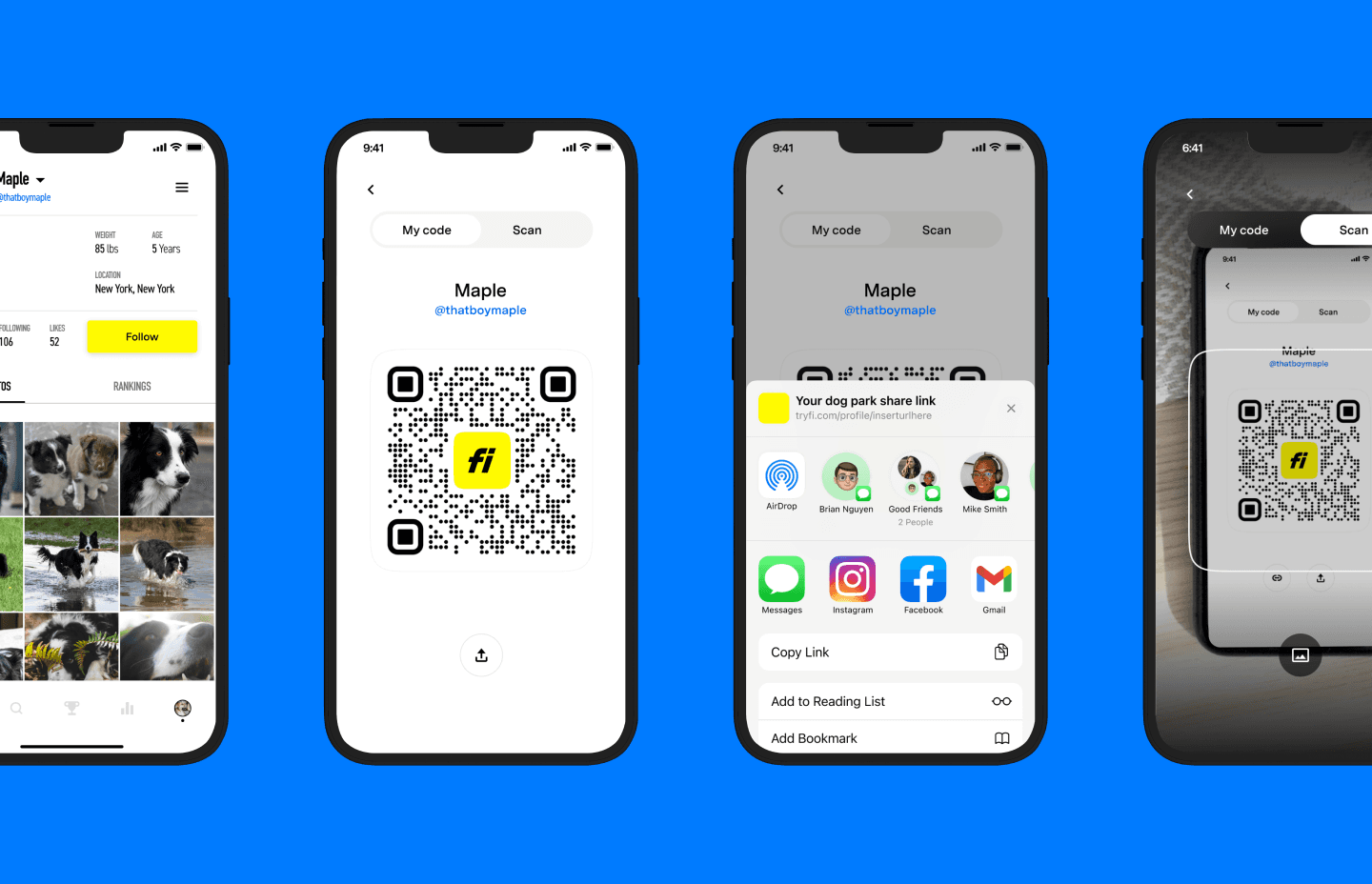
Sharing Profiles: We introduced a feature that enabled users to share and add dog profiles in real-time. This allowed dog owners to connect and follow each other's dogs' activities, fostering a sense of community.
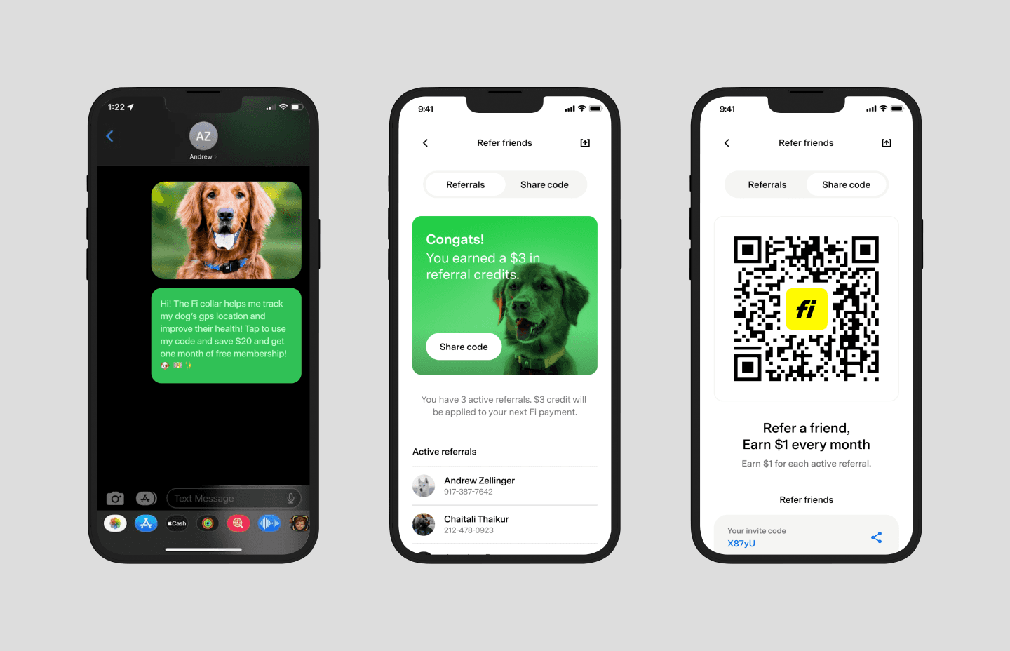
Referrals: To promote growth, we designed a referral system where users could share referral codes with friends. This feature included tracking successful referrals and offering rewards, encouraging users to spread the word about Fi.
Testing and Validation
Usability Testing: We conducted usability tests with a diverse group of users to validate our designs. Participants were asked to complete specific tasks within the app, and we gathered feedback on ease of use, visual appeal, and overall experience.
Feedback and Insights
The testing phase provided valuable insights:
▪ Positive Feedback: Users appreciated the new features and the app’s improved usability.
▪ Areas for Improvement: Some users found certain elements confusing or difficult to navigate. There were also requests for additional customization options.
Iterations Based on Feedback
Based on user feedback, we made several refinements:
▪ Enhanced Navigation: Improved the app’s navigation to make it more intuitive.
Additional Customization: Added more options for users to personalize their experience.
▪ Clearer Instructions: Provided clearer instructions and tooltips to guide users through new features.
Final Design and Implementation
Final Design: The final design incorporated all the new features and improvements, creating a cohesive and user-friendly experience. Key elements included:
▪ Breed-Specific Pages: Personalized landing pages that provided relevant information and targeted content.
▪ Enhanced Lost Dog Mode: A clearer and more effective interface for tracking lost dogs.
▪ Subscription and Checkout Flow: Simplified and streamlined processes that improved conversion rates.
▪ Community Features: Sharing profiles and referral systems that fostered connections among dog owners.
Implementation
I worked closely with Fi’s engineering team to ensure the designs were implemented accurately. This involved regular check-ins, design reviews, and testing on various devices to ensure compatibility and performance.
Outcomes and Results
Metrics and KPIs: Post-launch, we tracked several key metrics to measure the success of our designs:
▪ User Adoption: Increased adoption rates for the new features.
▪ User Engagement: High engagement levels with the app’s new functionalities.
▪ Conversion Rates: Improved conversion rates for subscriptions and collar purchases.
User Feedback: The feedback from users was overwhelmingly positive. They praised the app’s new features, ease of use, and the ability to personalize their experience. The community features were particularly well-received, fostering a sense of connection among dog owners.
Business Impact: The successful launch of the new features strengthened Fi’s market position and attracted more users. The improvements to the subscription and checkout flow boosted sales, while the referral system promoted organic growth.
Lessons Learned and Reflections
Challenges Faced:
▪ Balancing Innovation and Usability: Ensuring the new features were both innovative and user-friendly was a significant challenge.
▪ Technical Constraints: Working within the technical constraints of the Fi platform required creative problem-solving and close collaboration with engineers.
▪ Stakeholder Alignment: Achieving consensus among various stakeholders was essential to move forward with the design initiatives.
What I Learned:
▪ User-Centered Design: The importance of involving users throughout the design process to ensure the final product meets their needs.
▪ Iterative Process: The value of continuous testing and iteration to refine and improve designs.
▪ Collaboration: The necessity of strong collaboration between designers, engineers, and stakeholders to achieve successful outcomes.
Future Improvements
▪ Continuous Improvement: Regular updates and new features to keep the app fresh and engaging.
▪ Expanded Customization: Offering even more customization options to cater to a wider range of user preferences.
▪ Enhanced Community Features: Further developing social features to foster a stronger sense of community among users.
Conclusion
The Fi app project was a comprehensive and rewarding experience that showcased the power of user-centered design and strong collaboration. The new features and improvements not only enhanced the user experience but also strengthened Fi’s market position and drove growth. Reflecting on this project, it stands out as a significant achievement in my career, demonstrating the impact of thoughtful design and continuous iteration. The lessons learned and insights gained will undoubtedly influence my future work, ensuring I continue to create meaningful and impactful products.


